
Text and typography enhancements
 Advanced typography
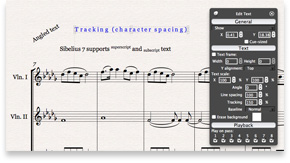
Sibelius 7 uses a brand new text editing and rendering engine that not only provides pixel-perfect accuracy between on-screen display—at any zoom level–and the printed page, but also delivers professional-quality typographic control.
Tracking (character spacing), leading (line spacing), character scaling (horizontal and vertical), and subscript/superscript text are accessible from the context-sensitive Inspector, allowing you to fine-tune the appearance of your text with a publisher’s precision.
DTP-style text frames
At last, you can create a text frame and flow text into it, with separate control over the alignment of the text frame on the page and the justification of the text within the frame. Right-align the text frame containing the composer’s name, but center-align the text within the frame, or create an editorial note with full text justification.
Gone are the days of adding of manual line breaks—now you can re-flow text simply by changing the shape or size of your text frame.
Hierarchical styles–only in Sibelius
Quickly make changes to groups of text styles by taking advantage of their new hierarchical design. Change, say, the font for one text style, and automatically cascade that change down to many other text styles. With Sibelius 7, it takes only a moment to change fonts or match a new house style.
Sibelius 7 also introduces character styles, designed to allow you to change parts of longer runs of text. Using a character style, you can quickly emphasize text throughout your score using italics, for example. If your editor suggests using bold instead, you can simply edit the character style to change every instance of italic to bold in a single operation.
No other music notation software offers this kind of power or control.
 Plantin from Monotype Imaging–only in Sibelius
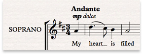
To demonstrate its new typography features, Sibelius 7 includes an elegant family of OpenType fonts called Plantin, from Monotype Imaging. Plantin has a distinguished history in printed music, and continues to be the main text font that Oxford University Press uses to publish music.
Plantin’s distinctive look and compact dimensions make it an ideal general-purpose font for titles, lyrics, and other text in your score.
